Add a Custom Widget
A custom widget lets you choose exactly which data to display and how to visualise it. The builder walks you through five steps.
Step 1 — Select a Data Source
Choose the type of data you want the widget to show. Data sources are grouped into four categories to help you find the right one quickly.
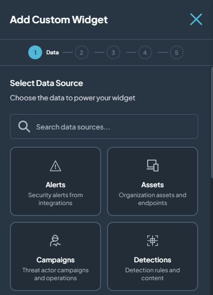
Security Data
These sources pull live data from your connected security tools and integrations.
| Data Source | What it shows | Good for |
|---|---|---|
| Alerts | Security alerts ingested from all your connected integrations. | Monitoring incoming threats and alert volume. |
| Assets | All organisation assets and endpoints tracked in Interpres. | Visibility into your asset inventory and exposure. |
| Campaigns | Threat actor campaigns and operations relevant to your environment. | Tracking active adversary activity. |
| Detections | Detection rules and detection content across your tools. | Understanding what your tools are actively detecting. |
| Identities | User accounts, service accounts, and identity-related risk. | Monitoring identity hygiene and access risk. |
| Integrations | Status and data from your connected security integrations. | Keeping track of integration health and coverage. |
| Software | Malware, adversary tools, and software tracked in your environment. | Understanding software-based risk. |
| Techniques | MITRE ATT&CK techniques and sub-techniques mapped to your environment. | Reviewing technique-level threat coverage. |
| Threat Groups | APT groups and adversary profiles relevant to your threat profile. | Tracking which threat actors pose a risk to you. |
| Visibility | Telemetry visibility and coverage across your security controls. | Identifying gaps in your detection coverage. |
| Vulnerabilities | CVE vulnerabilities and security issues affecting your assets. | Prioritising patching and remediation. |
Overview
High-level views of your organisation's security posture and trends.
| Data Source | What it shows | Good for |
|---|---|---|
| Scores | Security exposure scores with historical trend data. | Executive-level views and tracking improvement over time. |
| Threat Profile | Your organisation's active threat profile — the actors and techniques most relevant to you. | Aligning your dashboard to your specific risk context. |
| Trends | SOC and threat intelligence trend metrics over time. | Spotting patterns and changes in your security posture. |
Helpers
Non-data sources that let you add custom content or embed external resources into your dashboard.
| Data Source | What it shows | Good for |
|---|---|---|
| Embedded Content | An embedded external website or web application inside a widget frame. | Pulling in live dashboards, portals, or external tools. |
| Image | An image you upload, displayed directly on the dashboard. | Adding diagrams, process maps, or visual references. |
| Manual Data | Custom chart data you enter yourself as JSON. | Building widgets from data that is not in Interpres. |
| Static Content | Custom text, markdown, or notes displayed as a widget. | Adding context, instructions, or labels to your dashboard. |
SOC
Metrics and data focused on Security Operations Centre (SOC) performance and case management.
| Data Source | What it shows | Good for |
|---|---|---|
| Cases | Alerts that have been triaged into cases, including stage and response metrics. | Tracking open investigations and SOC workload. |
| SOC Metrics | Performance metrics and alert handling statistics for your SOC. | Reviewing analyst productivity and response times. |
| SOC Trends | Alert and case trend metrics over time. | Identifying patterns in alert volume and case resolution. |
Click the data source that matches what you want to track, then click Next.
Step 2 — Select Widget Type
Based on the data source you chose in Step 1, Interpres shows the widget types available for that data. Use the table below to quickly find which types work with your data source, then read the descriptions lower on this page to understand what each one looks like.
Availability Matrix
✅ = Available ❌ = Not available — = Not applicable (Helpers provide fixed content, no widget type selection)
| Widget Type | Alerts | Assets | Campaigns | Detections | Identities | Integrations | Software | Techniques | Threat Groups | Visibility | Vulnerabilities | Scores | Threat Profile | Trends | Cases | SOC Metrics | SOC Trends | Helpers |
|---|---|---|---|---|---|---|---|---|---|---|---|---|---|---|---|---|---|---|
| Table | ✅ | ✅ | ✅ | ✅ | ✅ | ✅ | ✅ | ✅ | ✅ | ✅ | ✅ | ✅ | ✅ | ✅ | ✅ | ✅ | ✅ | — |
| List | ✅ | ✅ | ✅ | ✅ | ✅ | ✅ | ✅ | ✅ | ✅ | ✅ | ✅ | ✅ | ✅ | ✅ | ✅ | ✅ | ✅ | — |
| Total Count | ✅ | ✅ | ✅ | ✅ | ✅ | ✅ | ✅ | ✅ | ✅ | ✅ | ✅ | ✅ | ✅ | ✅ | ✅ | ✅ | ✅ | — |
| Details | ✅ | ✅ | ✅ | ✅ | ✅ | ✅ | ✅ | ✅ | ✅ | ✅ | ✅ | ✅ | ✅ | ✅ | ✅ | ✅ | ✅ | — |
| Count Gauge | ✅ | ✅ | ✅ | ✅ | ✅ | ✅ | ✅ | ✅ | ✅ | ✅ | ✅ | ✅ | ✅ | ✅ | ✅ | ✅ | ✅ | — |
| Treemap | ✅ | ✅ | ✅ | ✅ | ✅ | ✅ | ✅ | ✅ | ✅ | ✅ | ✅ | ✅ | ✅ | ✅ | ✅ | ✅ | ✅ | — |
| Breakdown (Dynamic) | ✅ | ✅ | ✅ | ✅ | ✅ | ✅ | ✅ | ✅ | ✅ | ✅ | ✅ | ✅ | ✅ | ✅ | ✅ | ✅ | ✅ | — |
| Comparison (Bar) | ✅ | ✅ | ✅ | ✅ | ✅ | ✅ | ✅ | ✅ | ✅ | ✅ | ✅ | ✅ | ✅ | ✅ | ✅ | ✅ | ✅ | — |
| Bar List | ✅ | ✅ | ✅ | ✅ | ✅ | ✅ | ✅ | ✅ | ✅ | ✅ | ✅ | ✅ | ✅ | ✅ | ✅ | ✅ | ✅ | — |
| Breakdown (Pie) | ✅ | ✅ | ✅ | ✅ | ✅ | ✅ | ✅ | ✅ | ✅ | ✅ | ✅ | ✅ | ✅ | ✅ | ✅ | ✅ | ✅ | — |
| Breakdown (Donut) | ✅ | ✅ | ✅ | ✅ | ✅ | ✅ | ✅ | ✅ | ✅ | ✅ | ✅ | ✅ | ✅ | ✅ | ✅ | ✅ | ✅ | — |
| Breakdown (Padded Donut) | ✅ | ✅ | ✅ | ✅ | ✅ | ✅ | ✅ | ✅ | ✅ | ✅ | ✅ | ✅ | ✅ | ✅ | ✅ | ✅ | ✅ | — |
| Breakdown (Half Donut) | ✅ | ✅ | ✅ | ✅ | ✅ | ✅ | ✅ | ✅ | ✅ | ✅ | ✅ | ✅ | ✅ | ✅ | ✅ | ✅ | ✅ | — |
| Breakdown (Nightingale) | ✅ | ✅ | ✅ | ✅ | ✅ | ✅ | ✅ | ✅ | ✅ | ✅ | ✅ | ✅ | ✅ | ✅ | ✅ | ✅ | ✅ | — |
| Raw Data | ✅ | ✅ | ✅ | ✅ | ✅ | ✅ | ✅ | ✅ | ✅ | ✅ | ✅ | ✅ | ✅ | ✅ | ✅ | ✅ | ✅ | — |
| Coverage Gauge | ❌ | ❌ | ✅ | ❌ | ❌ | ❌ | ❌ | ❌ | ❌ | ❌ | ❌ | ❌ | ❌ | ❌ | ❌ | ❌ | ❌ | — |
| World Map | ❌ | ❌ | ✅ | ❌ | ❌ | ❌ | ❌ | ❌ | ❌ | ❌ | ❌ | ❌ | ❌ | ❌ | ❌ | ❌ | ❌ | — |
Note: Coverage Gauge and World Map rows will be updated as unique types for other data sources are confirmed.
Widget Type Descriptions
Descriptions of every widget type — what it looks like and when to use it.
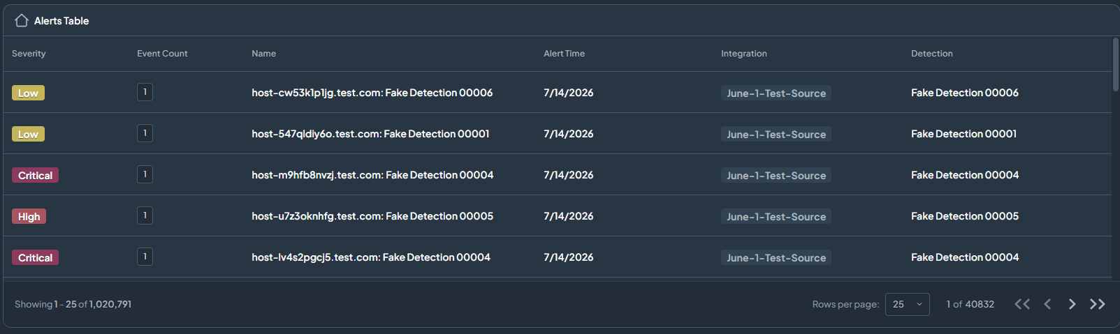
Table
Full data table view with sorting, paging, and multiple columns. Best when you need to review individual records in detail.
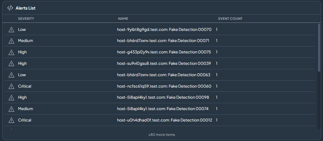
List
A compact, scrollable list showing a focused set of columns. Best for a quick scan of recent or top items.
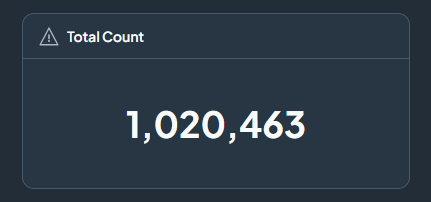
Total Count
A single bold number showing the total count of records matching your filters. Best for an at-a-glance health check on a dashboard.
Details
A full detailed view of individual records with forward/back pagination. Best when you need to read through each item one by one.
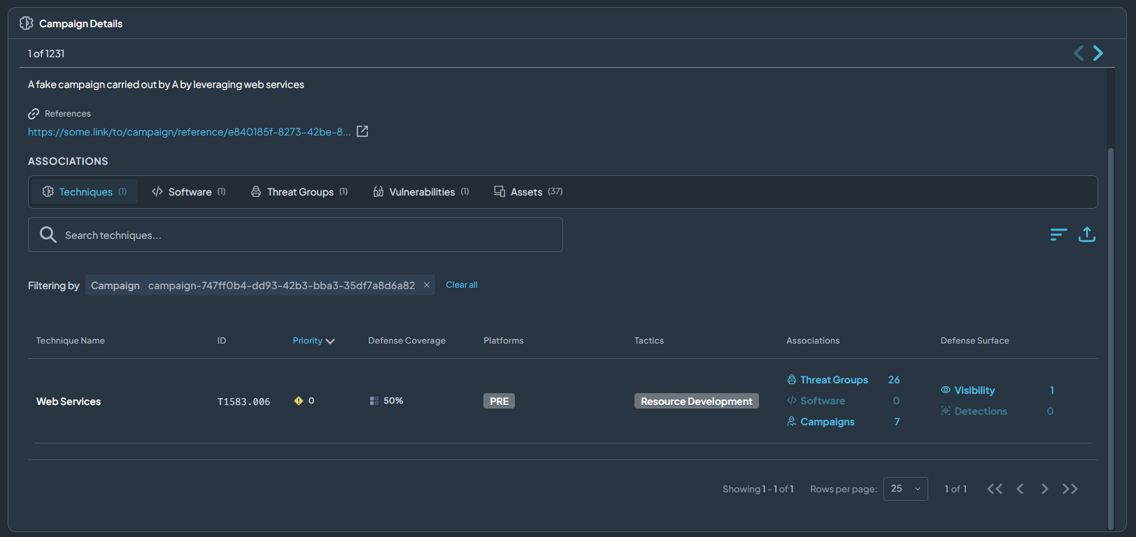
Count Gauge
A gauge dial comparing the count of filtered records against the total. Best for showing how a subset relates to the whole at a glance.
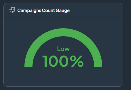
Treemap
Nested rectangles sized by count or value. Best for visualising distribution across many categories at once.
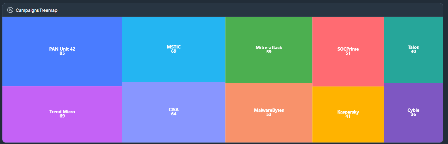
Breakdown (Dynamic)
A flexible chart you can switch between pie, donut, padded donut, half donut, nightingale, bar, and treemap — all from the same widget. Best when you want to explore data in multiple ways without building separate widgets.
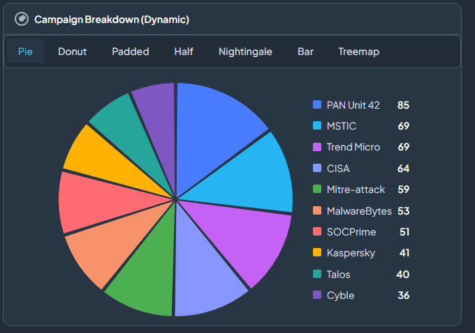
Comparison (Bar)
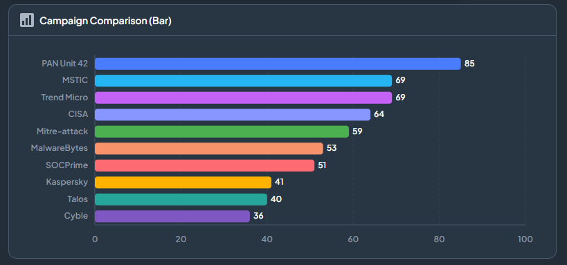
A bar chart comparing categories side by side. Best for answering "which category has the most?" questions.
Bar List
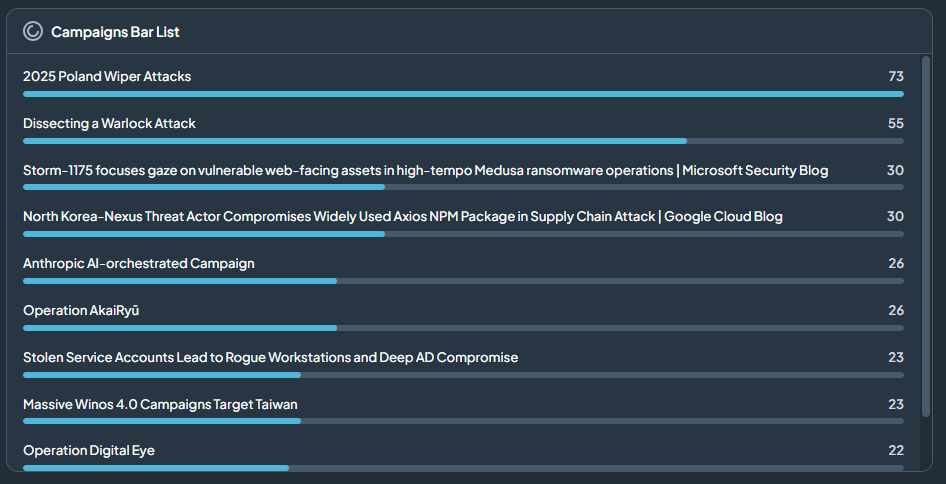
A ranked horizontal bar list ordered by count. Best for showing a top-N leaderboard of categories (e.g. top integrations by alert count).
Breakdown (Pie)
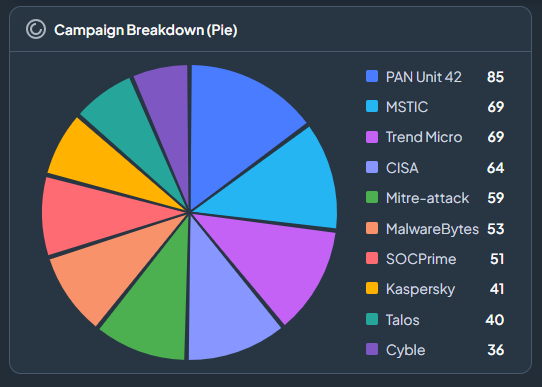
A pie chart showing the proportional split of records. Best when you have 5 or fewer categories and want to show "share of total".
Breakdown (Donut)
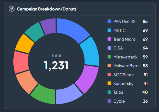
A donut chart — same as pie but with a hollow centre, often used for a cleaner look. Best for the same scenarios as Pie.
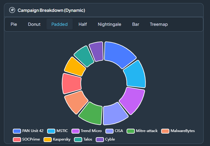
Breakdown (Padded Donut)
A donut chart with spacing (padding) between each segment, making individual slices easier to distinguish. Best when categories are close in value and you need clearer visual separation.
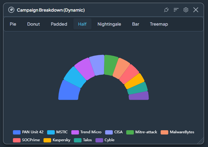
Breakdown (Half Donut)
A semicircular donut chart that uses only the top half of the ring. Best when vertical space is limited and you still want a proportional breakdown.
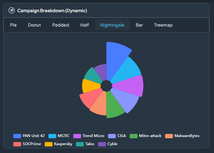
Breakdown (Nightingale)
A rose chart (also called a polar area chart) where each segment has equal angle but varying radius based on value. Best for comparing categories when you want a visually distinctive alternative to a standard pie chart.
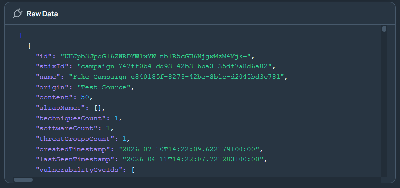
Raw Data
Displays the raw JSON data powering the widget. Best for advanced users who need to inspect or export the underlying data.
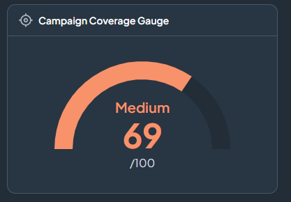
Coverage Gauge (Campaigns only)
A gauge showing the average detection coverage across all filtered campaigns. Helps you understand how well your controls cover the campaigns targeting your organisation.
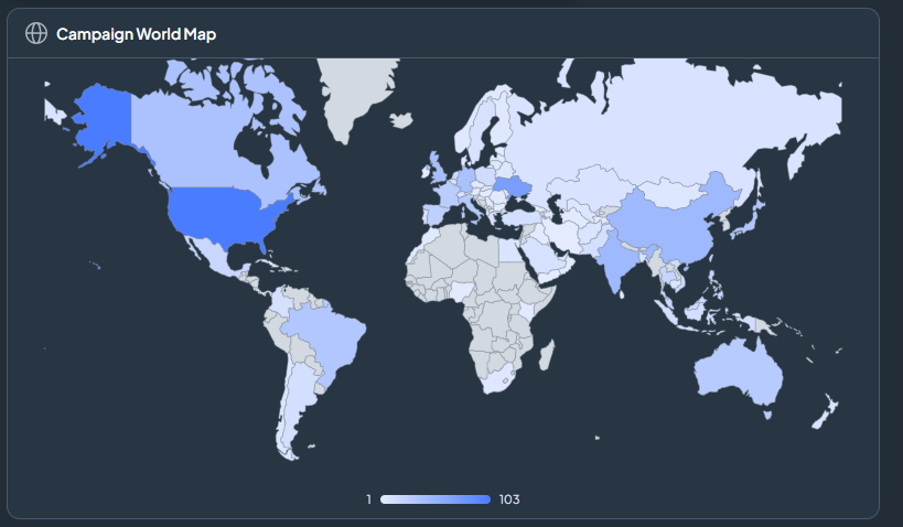
World Map (Campaigns only)
A geographic map showing where campaign targets are located. Best for understanding the geographic focus of threat actor campaigns.
Click the widget type you want, then click Next.
Step 3 — Set Filters
Filters narrow down the data so your widget shows only what is relevant to you. The available filters depend on the data source you selected in Step 1. You do not have to fill in every filter — leave any field blank to include all values for that option.
Tip: The more specific your filters, the more focused and useful the widget will be.
Security Data Filters
Alerts
| Filter | What it does |
|---|---|
| Time Range | Show alerts from a specific period (e.g. last 24 hours, last 7 days, custom range). |
| Severity | Limit to Critical, High, Medium, Low, or Informational alerts. |
| Status | Filter by alert state — Open, In Progress, or Closed. |
| Integration | Show alerts from one specific connected tool only. |
| Alert Type | Filter by the category or type of alert. |
| Asset | Show alerts linked to a specific asset or endpoint. |
Assets
| Filter | What it does |
|---|---|
| Asset Type | Filter by device type (e.g. server, workstation, cloud instance). |
| Operating System | Limit to a specific OS or OS family. |
| Risk Score | Show only assets above or below a risk score threshold. |
| Tags | Filter by asset tags applied in your environment. |
| Integration | Show assets discovered by a specific integration. |
Campaigns
| Filter | What it does |
|---|---|
| Threat Actor | Limit to campaigns associated with a specific adversary. |
| Date Range | Show campaigns active within a date window. |
| Status | Filter by campaign activity status. |
| MITRE Technique | Show campaigns that use a specific ATT&CK technique. |
Detections
| Filter | What it does |
|---|---|
| Severity | Limit to detections of a specific severity level. |
| Integration | Show detections from one tool only. |
| Status | Filter by detection status (enabled, disabled, firing). |
| Detection Type | Narrow by the category or class of detection. |
Identities
| Filter | What it does |
|---|---|
| Identity Type | Filter by user account, service account, or privileged account. |
| Risk Level | Show only identities above a risk threshold. |
| Status | Filter by account status (active, inactive, locked). |
| Group / Department | Limit to identities in a specific organisational group. |
Integrations
| Filter | What it does |
|---|---|
| Integration Type | Filter by category (EDR, SIEM, identity, cloud, etc.). |
| Status | Show only active, inactive, or erroring integrations. |
Software
| Filter | What it does |
|---|---|
| Software Type | Limit to malware, adversary tools, or specific software categories. |
| Risk Level | Show only software above a risk threshold. |
| Asset | Filter by the asset the software is associated with. |
Techniques
| Filter | What it does |
|---|---|
| MITRE Tactic | Limit to techniques under a specific ATT&CK tactic (e.g. Initial Access, Persistence). |
| Coverage Status | Show techniques that are covered, not covered, or partially covered. |
| Technique ID | Filter to a specific ATT&CK technique by its ID (e.g. T1059). |
Threat Groups
| Filter | What it does |
|---|---|
| Region | Limit to threat groups targeting specific geographies. |
| Target Industry | Show groups known to target your industry sector. |
| Activity Status | Filter by active or inactive adversary groups. |
Visibility
| Filter | What it does |
|---|---|
| Control Type | Filter by security control category (e.g. EDR, firewall, identity). |
| Coverage Status | Show areas with full, partial, or no visibility. |
| Data Source | Limit to visibility data from a specific integration. |
Vulnerabilities
| Filter | What it does |
|---|---|
| CVSS Score | Show vulnerabilities above a specific severity score. |
| Status | Filter by remediation status — Open, In Progress, or Patched. |
| Asset | Limit to vulnerabilities affecting a specific asset. |
| CVE Age | Filter by how recently the CVE was published. |
Overview Filters
Scores
| Filter | What it does |
|---|---|
| Time Range | Show score history over a specific period. |
| Score Type | Limit to a specific exposure or risk score category. |
Threat Profile
| Filter | What it does |
|---|---|
| Coverage Status | Show techniques that are covered or not covered by your controls. |
| Tactic | Limit to a specific ATT&CK tactic in your threat profile. |
Trends
| Filter | What it does |
|---|---|
| Time Range | Set the period over which trend data is calculated. |
| Metric Type | Select which trend metric to display (e.g. alert volume, coverage score). |
SOC Filters
Cases
| Filter | What it does |
|---|---|
| Case Stage | Filter by stage in the triage workflow (e.g. New, Investigating, Resolved). |
| Severity | Limit to cases of a specific severity level. |
| Analyst | Show cases assigned to a specific analyst. |
| Time Range | Limit to cases created or updated within a date range. |
SOC Metrics
| Filter | What it does |
|---|---|
| Time Range | Set the period for the metric calculation. |
| Analyst | Filter metrics by individual analyst. |
| Integration | Limit to metrics from alerts sourced from a specific tool. |
SOC Trends
| Filter | What it does |
|---|---|
| Time Range | Set the period over which trends are measured. |
| Metric Type | Choose which SOC metric to trend (e.g. case resolution time, alert volume). |
Note: Helper data sources (Embedded Content, Image, Manual Data, Static Content) do not have filters — they display fixed content you provide.
Click Next when ready.
Step 4 — Configure Display Settings
Give your widget a name and adjust how it looks on the dashboard.
- Enter a Widget Title that clearly describes what it shows.
- Adjust any display options shown (for example column selection, sort order, or colour).
Click Next when ready.
Step 5 — Review and Add
Check the preview of your widget.
- If everything looks right, click Add Widget to place it on the dashboard.
- Use the Back button to go back and change any setting.
Once added, drag the widget to position it and resize it from the edges to fit your layout.